Middle School Creating and Interpreting Graphs
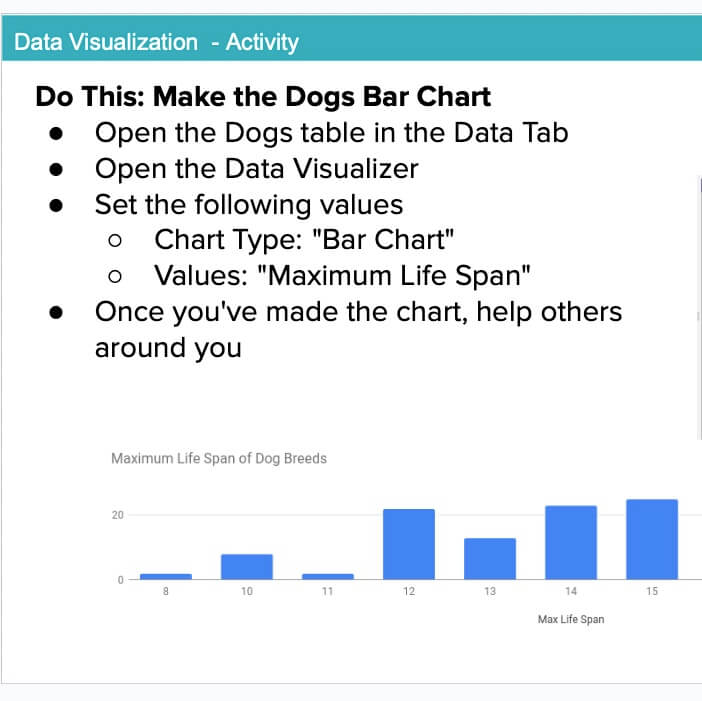
Students will practice making conclusions from charts and learn to use the Data Visualizer in App Lab to create two different kinds of charts: a bar chart, and a histogram. This tool is designed to quickly connect students with real-world datasets and make it easy to create visualizations from data without learning how to navigate a more complex tool. They will also have access to several real-world datasets that they can use to create their charts.
Materials
-
Data Visualization Lesson Plan - Code.org
https://studio.code.org/s/explore-data-1-2021/lessons/1 -
Activity Guide
https://docs.google.com/document/d/15oXKCaqWYPaiBZGW-xW-HFsnwbFsMMdbVwQmxD9K3UY/edit?tab=t.0
Tips for Running Activity
- Try using the Data Visualizer ahead of time yourself to make some of the charts students will create as part of completing the lesson.
- Watch one these videos to help you, and your students, understand how to use the visualizer:
- Try using the Data Visualizer ahead of time yourself to make some of the charts students will create as part of completing the lesson.
- Watch one these videos to help you, and your students, understand how to use the visualizer:
- Try using the Data Visualizer ahead of time yourself to make some of the charts students will create as part of completing the lesson.
- Watch one these videos to help you, and your students, understand how to use the visualizer:
Assessment Opportunity
- Have students consider if there are different or better ways to graph the information. See if they can get the visualizer to produce that output.
- Have students consider if there are different or better ways to graph the information. See if they can get the visualizer to produce that output.
- Have students consider if there are different or better ways to graph the information. See if they can get the visualizer to produce that output.
Extension Opportunities
- This website has a ton of other lessons and activities about data visualization that you can explore with your students if they are enjoying this activity.
- This website has a ton of other lessons and activities about data visualization that you can explore with your students if they are enjoying this activity.
- This website has a ton of other lessons and activities about data visualization that you can explore with your students if they are enjoying this activity.